
Plotting challenge
All scientists produce data of one kind or another. In most cases, the optimum way to survey these data is to plot them. Since the data often evolve in a systematic fashion as a function of an external parameter (temperature, voltage, polarization, magnetic field, ...), it is often advantageous to display all of them in a single plot. And because the examination of data is the core business of any sciencist, this plot should be obtained in the easiest and quickest way possible.
The challenge: find the fastest method to plot all data in the current directory in a single plot window with a custom range for the x axis.
The winner:
graph -T X -x xmin xmax *.dat
Naturally, the conditions of this competition ruled out the usual suspects such as gnuplot, octave, R, matplotlib, etc. as well as GUI driven solutions such as qtiplot, labplot, grace, etc. If you don't believe that, try gnuplot for the task defined in the challenge and be surprised.
I've indeed explored a few of these dead ends until I suddenly remembered that there once was a direct command for plotting … a command with a very intuitive name …
Graph is part of the plotutils which were already mature when I've first used them 20 years ago. And then I forgot all about them! What a shame!
Obviously, none of the young wanna-be-nerds participating in this competition ever heard of graph. 😄 But Anan came dangerously close with
ctioga -X --xrange xmin:xmax *.dat
That the above comand didn't work at all since xpdf crashed with a seg fault did not, however, impress the jury favorably. 😄 In any case, graph's syntax is more concise. 😉
After some search we quickly found that 'ctioga2 --viewer okular --xrange xmin:xmax *.dat' works even under Bugbuntu and produces a visually much better result than my graph command above. But don't let that mislead you: that's just because of the rather outdated X backend of graph (which does not support anti-aliasing). You can create publication quality figures using the ps and svg backends of graph. Look at the following plots, for example: I have fabricated the one on top using Origin six years ago, and the bottom one using graph and the oneliner below yesterday (the top axis, arrows and labels were added by inkscape; differences are intentional).

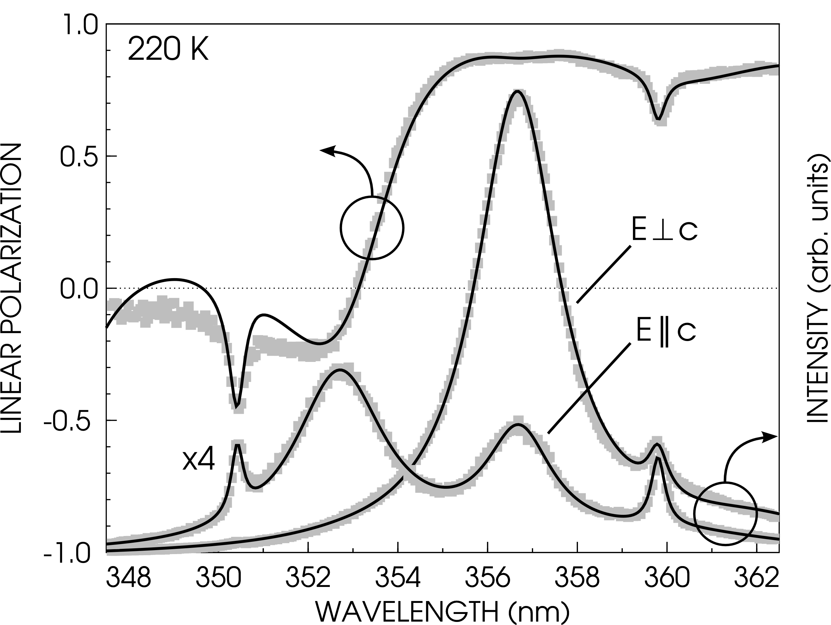
graph -T svg -C -h 0.55 -w 0.7 -g 1 -x 347.5 362.5 -y -1 1 --pen-colors 1=gray:2=black   \
 -F AvantGarde-Book -X "WAVELENGTH (nm)" -Y "LINEAR POLARIZATION" -m -1 -S 17 rhoexp.dat \
 -m 2 -S -W 0.003 rhofit.dat --reposition 0 0 1 --blankout 0 -N y -y 0 11000 -E y        \
 -Y "INTENSITY (arb. units)" -m -1 -S 17 uw1031exp.dat -m 2 -S uw1031fit.dat -m -1 -S 17 \
 uw1040exp.dat -m 2 -S uw1040fit.dat > plot.svg
Let's dissect that command step-by-step:
-T:     type of backend, here svg for easy editing in inkscape
-C:     colors
-h, -w:     height and width
-g:     grid style
-x, -y:     x and y range
--pen-colors:   custom colors for symbols and lines
-F:     font for axes and labels
-X, -Y:     x and y axes labels
-m:     linestyle and color (-n means no line and color style n)
-S:         symbol type (-S without number means no symbol)
-W:     line width
--reposition:   creates a second graph here with coordinates 0,0 and size 1 (same as first one)
--blankout: white-out around second graph, 0: no white-outdated
-N:     no ticks and labels, here for y axis
-E:     use top x or right y axis.
It's really quite intuitive, I think. 😊