Command Center

Most administrative tasks are done best with the keyboard in a terminal. Hence, tiling window managers are such a bless for system administration. But what to do on a "normal" desktop, i.e., one with a desktop environment such as KDE or Gnome?

Well, the window manager of KDE, kwin, fully supports tiling since version 4.5. It works well, but I was never able to work with it to my full satisfaction. I frequently use applications with too different requirements regarding window placement and size, and the tiling feature then often hinders instead of being of help.

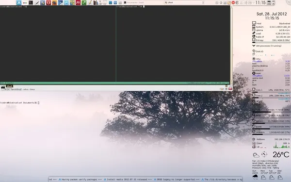
I instead found a solution which kind of separates my usual desktop activity and serious administrative work. Look at the following screenshot:

desktop screenie

What you see there is a KDE desktop with the taskbar on top, conky to the right, netnewsticker at the bottom, and a transparent urxvt just above. Now, I use the latter for simple tasks such as 'sudo pacman -S tmux', but for more complicated matters I turn to the combination of yakuake and tmux you see in the top left of the desktop.

Yakuake is a drop-down terminal emulator based on the KDE konsole which slides down upon a press of F12, very much like the consoles used in Quake. Tmux is a terminal multiplexer with many features, of which I use only a few. If you are interested, look here and there, and memorize the following minimum set of commands (all of which are preceded by a Ctrl-b) :

"               split pane horizontally
%               split pane vertically
arrow key           switch pane
hold control, arrow key     resize pane
c               (c)reate new window.
n               (n)ext window.
p               (p)revious window.

You can, of course, rebind all commands.

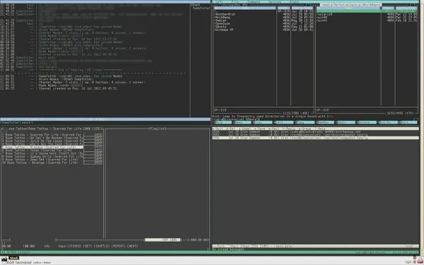
By using tmux, one can turn the above inconspicuous yakuake window into a full fledged tiled desktop by going into full screen mode (Ctrl-Shift F11). For example:

desktop screenie

From left-up to right-down: weechat, moc, mc, mutt.

Press F12, and *puff* you're back at your "normal" desktop.
Serious sauce is serious

Some time ago, I was delighted to find a decent hot sauce in the store around the corner. When I checked last week, however, these sauces had disappeared. Upon my inquiry I was told that "this product was not accepted by our customer base". Why didn't I try this new product, the "all natural hot chili paste"? Very hot, and so natural!

Since arguing was futile, I gave in and took the paste. In a kind of desperate and naive hope I also bought the Habanero sauce from the bio store next door. At home, I tried both at once, and discovered that their “hotness” is on the same level as the mild peperoni from the pizza delivery.

All right, this is Berlin, and I can simply take the U-Bahn and go to the Pfefferhaus in Mitte. Or I can order online, which is what I finally did.

hot sauces

These are three examples out of the selection of sauces I've ordered. Notwithstanding the lurid packages, these are good-tasting and truly satisfying sauces. In contrast to super market sauces, they don't sting your tongue, but manifest themselves primarily by a slow heat building up in the throat. The dose is just right if every breath makes you feel like a dragon: invincible and full of life.

The ghost on the left, by the way, is not one of the usual metaphors in this business for death, but originates from the main ingredient of this sauce: the Naga Bhut Jolokia Chili also referred to as ghost pepper. It scares elephants, but attracts me. 😉

Rote Grütze

Another favorite of mine when I was young, always expertly prepared by my grandma. Let's come straight to the point.

1 Glas (700 g) Schattenmorellen
400 g tiefgefrorener Beerenmix (Him-, Johannis, Erd-, und Heidelbeeren)
70 g Perlsago
250 ml Kirschsaft
70 g Zucker

Kirschsaft in mittelgroßem Topf geben, Zucker zugeben und verrühren. Beeren und Kirschen unterheben und aufkochen. Saft abseihen, in kleinen Topf geben und Sago einstreuen. Circa 30 min köcheln bis Sagokörner transparent sind. Früchte dazugeben und nochmals 5 min köcheln. Masse abkühlen lassen, mit Frischhaltefolie abdecken und über Nacht in den Kühlschrank stellen.

Je nach Geschmack kleine Portion auf flachen Teller geben und mit Vanillesauce anrichten. Oder großzügig Vanillesauce in tiefen Teller gießen, und künstliche Grützeinseln mit möglichst abrupten und tiefen Schluchten entstehen lassen. 😊 Guten Appetit!

Sync, backup and share

Cloud storage services are rapidly becoming a familiar part of our digital life, and we will soon take it for granted that we can backup, synchronize and share our data in an effortless way. Thus even the big players such as Google and Microsoft hurry to jump on the bandwagon.

But which one these services should you use? Well, if you run your own server, consider setting up your own cloud using ownCloud. This community-driven development offers all what its commercial competitors offer and more. In particular, your data remain under your control. If all you want is to synchronize files between several locations (such as office and home), even the spartan SparkleShare (which only requires git and sshd to run) may suffice.

If you don't run your own server, you have the choice between several commercial offers which all include a basic plan which is free of charge. The most popular of these offers are, in alphabetical order, Crashplan, Dropbox, Google Drive, Microsoft's Skydrive, Spideroak, Sugarsync, Ubuntu One, and Wuala. Sorted by popularity, it's Dropbox, Dropbox, and Dropbox.

Seriously, the people I know either don't use cloud storage at all or Dropbox. But it this popularity justified?

An informed and detailed analysis of several cloud storage services has been published earlier this year by the Fraunhofer-Institut für sichere Informationstechnologie in Darmstadt. The four page management summary provides an excellent overview, but I recommend reading at least the relevant parts of the actual report.

You'll see there, for example, that Dropbox features synchronization and sharing, but no backup, and offers a server side encryption only. The free offer is limited to 2 GB, and all storage is done on Amazon's servers which are subject to US law (aka Patriot Act). Teamdrive and Wuala store on EU servers with client-side encryption and a backup option in addition to synchronization and sharing. Whereas Wuala's free offer includes 5 GB of storage, Teamdrive even provides a server component which will allow the storage of 10 GB on a server of your choice.

Whatever you chose, chose deliberately and not what the mainstream suggests.

Wrong direction

I dislike market structures which essentially establish a (quasi-)monopoly. I've thus supported AMD whenever their CPUs' price/performance ratio was as good or better than that of their counterparts produced by Intel. That happened to be the case between 2000 and 2005.

My current desktop, however, dates back to the time of Intel's Core 2 series (launched July 2006). At that time, AMD had no comparable offer. My desktop is thus equipped with one of the first Conroe models, an E6600. When coupled with 8 GB of RAM, the performance of this CPU is adequate for everyday tasks even after almost 6 years.

Just recently, I've looked for a very low-priced notebook with sufficient performance for multimedia applications. The Fujitsu lifebook I've got for a mere €299 features a current low-end Intel CPU (Pentium P6200), 4 GB of RAM and a 500 GB hard disk. Benchmarks indicate that the system is on average on par with my desktop.

Now let's look at what AMD has to offer. The latest and greatest incarnation of AMDs' mobile processor platform is called 'Trinity' and is based on the Bulldozer architecture. The top model of this line (the A10-4600M) was tested in c't 12/2012. The following table compares the Cinebench marks (single- and multi-threaded) for the Trinity top model with the two Intel CPUs mentioned above and an older (Phenom II) dual core from AMD:

Model
Year
Cores
Frequency (GHz)
Single
Multi
E6600
2006
2
2.4
2458
4698
P6200
2010
2
2.13
2395
4668
X2 N620
2010
2
2.8
2305
4472
A10-4600M
2012
4
3.2/2.3
2048
5660

Despite the turbo, the A10 has a worse single-thread performance than any of the older and lower-clocked dual cores listed here. Note that the single-thread performance still largely determines the user experience under any operating system. All browsers, for example, are essentially single-threaded and will stay so for the time to come.

Per GHz, the A10 offers 640 Cinebench marks compared to the 820 of its 2 years old dual-core predecessor. Both are dwarfed by the 1120 marks of my low-end P6200. That means that AMD needed 12 years to develop an architecture with such a low performance per cycle that even its much higher clock-rate cannot compensate for it.

Let's start to worry about AMD.

Panthera uncia pumilus

snow leopard

Name:           Indy [1]
Sex:            Male
Age:            1 year
Weight:         4.9 kg [2]
Jump height:            1.50 m
Jump reach:     2 m
Eye color:      Indigo
Occupation:     Privatier
Favors:         Venison, Lamb, Beef
Dislikes:       Chicken, Turkey
Loves:          sunny Sundays at the window, rainy Mondays in the hammock
Appearance:     cute as a button
Character:      pure gold

[1]
[2]

Plotting challenge

All scientists produce data of one kind or another. In most cases, the optimum way to survey these data is to plot them. Since the data often evolve in a systematic fashion as a function of an external parameter (temperature, voltage, polarization, magnetic field, ...), it is often advantageous to display all of them in a single plot. And because the examination of data is the core business of any sciencist, this plot should be obtained in the easiest and quickest way possible.

The challenge: find the fastest method to plot all data in the current directory in a single plot window with a custom range for the x axis.

The winner:

graph -T X -x xmin xmax *.dat

Naturally, the conditions of this competition ruled out the usual suspects such as gnuplot, octave, R, matplotlib, etc. as well as GUI driven solutions such as qtiplot, labplot, grace, etc. If you don't believe that, try gnuplot for the task defined in the challenge and be surprised.

I've indeed explored a few of these dead ends until I suddenly remembered that there once was a direct command for plotting … a command with a very intuitive name …

Graph is part of the plotutils which were already mature when I've first used them 20 years ago. And then I forgot all about them! What a shame!

Obviously, none of the young wanna-be-nerds participating in this competition ever heard of graph. 😄 But Anan came dangerously close with

ctioga -X --xrange xmin:xmax *.dat

That the above comand didn't work at all since xpdf crashed with a seg fault did not, however, impress the jury favorably. 😄 In any case, graph's syntax is more concise. 😉

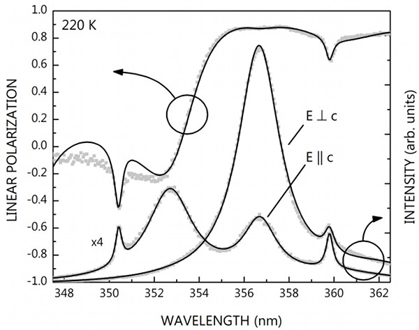
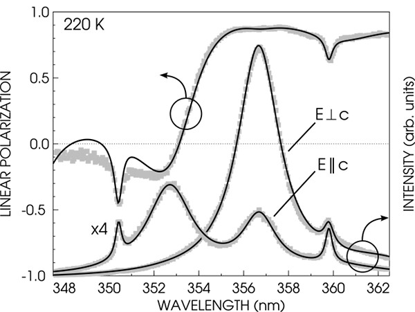
After some search we quickly found that 'ctioga2 --viewer okular --xrange xmin:xmax *.dat' works even under Bugbuntu and produces a visually much better result than my graph command above. But don't let that mislead you: that's just because of the rather outdated X backend of graph (which does not support anti-aliasing). You can create publication quality figures using the ps and svg backends of graph. Look at the following plots, for example: I have fabricated the one on top using Origin six years ago, and the bottom one using graph and the oneliner below yesterday (the top axis, arrows and labels were added by inkscape; differences are intentional).

Origin

Origin

graph -T svg -C -h 0.55 -w 0.7 -g 1 -x 347.5 362.5 -y -1 1 --pen-colors 1=gray:2=black   \
 -F AvantGarde-Book -X "WAVELENGTH (nm)" -Y "LINEAR POLARIZATION" -m -1 -S 17 rhoexp.dat \
 -m 2 -S -W 0.003 rhofit.dat --reposition 0 0 1 --blankout 0 -N y -y 0 11000 -E y        \
 -Y "INTENSITY (arb. units)" -m -1 -S 17 uw1031exp.dat -m 2 -S uw1031fit.dat -m -1 -S 17 \
 uw1040exp.dat -m 2 -S uw1040fit.dat > plot.svg

Let's dissect that command step-by-step:

-T:     type of backend, here svg for easy editing in inkscape
-C:     colors
-h, -w:     height and width
-g:     grid style
-x, -y:     x and y range
--pen-colors:   custom colors for symbols and lines
-F:     font for axes and labels
-X, -Y:     x and y axes labels
-m:     linestyle and color (-n means no line and color style n)
-S:         symbol type (-S without number means no symbol)
-W:     line width
--reposition:   creates a second graph here with coordinates 0,0 and size 1 (same as first one)
--blankout: white-out around second graph, 0: no white-outdated
-N:     no ticks and labels, here for y axis
-E:     use top x or right y axis.

It's really quite intuitive, I think. 😊

Miscellanea

To calculate the average or the maximum of the second column of data files, do

awk '{sum += $2} END {printf ("%f\n", sum/NR)}' $1

or

awk 'BEGIN {max = 0} {if ($2>max) max=$2} END {print max}' $1

The latter one is particularly useful for a quick-and-dirty plot of normalized spectra with gnuplot.


The easiest way to get the geometry of an image is

identify -format "%wx%h\n" *

To enable applications requiring X to be started with root rights without having access to kdesu or gksu, steal the magic cookie from your users 😄

xauth add `xauth -f ~user/.Xauthority list $DISPLAY`

Library

One reader has suspected the "little tablet-like thingie" underneath the laptop on the left of the network diagram one post below to be an iPad. Let me assure you: it is not an iPad.

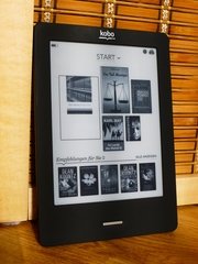
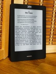
It is in fact an e-book reader, and more precisely a Kobo Touch which I've acquired around Christmas:

top view top view top view

At that time and in this country, only Kobo and Sony offered what I wanted, namely WiFi access, a touch screen and the latest display technology. But I wouldn't have bought a Kindle anyway: Amazon's infrastructure reminds me of Apple's, and I strongly prefer an open attitude to the rest of the world (including an easy access to e-pubs without the need for calibre).

Am I satisfied with the Kobo? More than I anticipated. I still prefer real books for their tactile and olfactory feedback, but one can't possibly argue with a 185 g device holding an entire library. Having a search function, a dictionary and a built-in shopping solution doesn't hurt the case either. It is a new dimension of reading, period. And the Kobo utilizes this dimension quite nicely, I think.

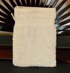
Speaking about niceties: when you look at the photographs above, you're probably surplussed about the cover I've chosen. Really looks like a wash-glove, doesn't it? Yes, but it does so only from the outside! Inside it is made of carbon and titanium. It has an invisible organic solar module which supplies sufficient power for the Kobo to last indefinitely, and built-in organic LEDs which provide a dimmable reading light in the night.

Naaaa, it's just a wash-glove. 😄 The manila cover I actually bought gave off such a putrid stench that I couldn't use it. It's unbearable, and overpowering even after three month and a machine wash. Well, I love the glove. It's made of bio-cotton, fits perfectly, and attracts a lot of attention in the subway.